Information Dashboards in Education —the Big Picture

Dashboards can tap into the tremendous power of visual perception to communicate, but only if those who implement them understand visual perception and apply that understanding through design principles and practices that are aligned with the way people see and think. Software won’t do this for you. It’s up to you ( Few, 2006, p. 12 ).
Overview
In this dissertation, we investigate the design and use of teachers’ dashboards to inform pedagogical practices when assisting learners in using online learning platforms. We seek specifically to extend our understanding of not only what teachers are supposed to do or can do with dashboards, but more importantly what they actually do with them in everyday practice, along with sociotechnical factors, pedagogical practices, and the design challenges that such tools underpin. We build upon a large body of research from different fields, including social science, human-computer interaction, human-centered design, information visualization, learning analytics, and the wider technology-enhanced learning domains, to name but a few.
In this chapter, we structure and discuss related works in six main themes relevant to this dissertation:
- Introducing Information Dashboards: In this section, we place the work conducted for this dissertation in the context of information-driven dashboards. In particular, we emphasize the most interesting and challenging features of dashboards, such as visual encoding, different contexts of use, different audiences, glanceable readings.
- Introducing Learning Analytics: In this section, we introduce the field of learning analytics. We place particular emphasis on harnessing learning data to improve teaching and learning experiences and outcomes through the use of information-driven tools and visualizations when leveraging human informed judgment.
- Monitoring Learners’ Activity: In this section, we focus on research into teacher-facing dashboards aimed at supporting monitoring of learners’ activity when using online learning materials. We organize and discuss research in this area in three main themes: proactive monitoring, classroom monitoring, and retrospective monitoring.
- Fostering Sociotechnical Factors: In this section, we focus on research into fostering sociotechnical factors through the use of teacher-facing dashboards, particularly highlighting how dashboards can go beyond log-based measurable metrics and features by fostering important human factors, such as data sense-making, awareness, socio-affective relationships, and reflection, when using learning dashboards.
- Evaluating Teachers’ Dashboards: In this section, we focus on methods adopted when evaluating teachers’ dashboards. In particular, we organize and discuss empirical studies in two main themes: usability and usefulness oriented evaluations, as well as pedagogical practice-oriented evaluations.
- Dashboard Design and Use: Taking a top-down approach, in this section, we discuss work on teachers’ dashboard design and use from a methodological perspective.
Introducing Information Dashboards
Before describing and discussing some interesting features which merit in-depth study and research, of dashboards in informatics or, as we know and use them nowadays, the etymology of the word “dashboard” also provides some noteworthy facts.
Origin —Enabling Drivers to See Along and Ahead
The main strand of the origin of the term “dash-board” can be rooted in motive (and motion), around 5,000 years ago or, more specifically, to the human-horse relationship ( de Barros Damgaard et al., 2018 ), which was a key turning point in revolutionizing not only transport but the world as we know it today. Although the solid disk wheel was first invented way before domestication of the horse, in the fairly early Bronze age, it was only in the middle Bronze era that Bronze age inventors put together the chariot: a box on top of wheels. This invention opened up immense opportunities for human travel and carriage.
Interestingly, the use of the term “dashboard” originates from the jargon of the horse-drawn carriage. Way back then, as Figure 1 portrays, since most routes were not paved, people came up with the idea of placing a board (“screen”) made of wood or leather which they called “dashboard”, on the forepart of the horse-drawn open carriage to “stop [prevent] mud from being splashed [“dashed”] into the vehicle by the horse’s hooves” ( Etymonline, n.d. ). The tool was designed to intercept dirt so to protect the vehicle and its passengers, and by doing so the dashboard freed the riders (“drivers”) from distractions to enable them to focus and see (“monitor”) the route along and ahead.
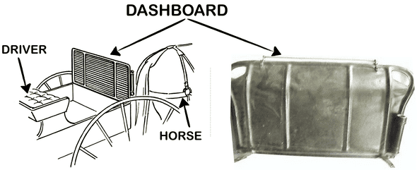 Figure
1: Example of a horse-drawn
carriage “dashboard”. The tool is designed to protect the driver and passengers
by catching dirt, dust, and debris thrown up by the horse’s hooves. A salient
function of the tool is to free the rider from distractions so s/he can see the
route along and ahead.
Figure
1: Example of a horse-drawn
carriage “dashboard”. The tool is designed to protect the driver and passengers
by catching dirt, dust, and debris thrown up by the horse’s hooves. A salient
function of the tool is to free the rider from distractions so s/he can see the
route along and ahead.
Moving from the horse-drawn carriage to much more modern auto-motives, see cars, dashboards have retained not only the name but also their focal place and function. As Figure 2 portrays, during this evolution, dashboards have evolved from a simple wooden or leather static object in front of the rider to a board “on which control panels and gauges are mounted” ( Etymonline, n.d. ) to enable drivers to best monitor the status of the vehicle and control its behavior. Over time dashboards have gained an essential role in the history of monitoring by providing drivers and passengers with formative, quality, and safety ensuring metrics.
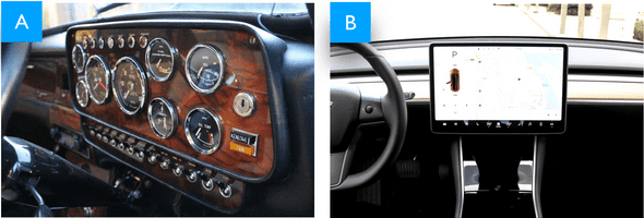 Figure
2: On the left (A) is an example
of an old Mini Cooper 1275-S-Mk3 car’s dashboard. This dashboard presents
critical status information, using gauges for, e.g., speed, fuel, oil, water;
color-coded flags; buttons; also, the information is structured on the layout to
facilitate glanceable readings, for instance, important metrics are scaled up
and placed in the center to best match the viewport of the driver almost all the
ingredients of a digital dashboard. On the right (B) is an example of a Tesla
model S car’s dashboard. This dashboard portrays a nice joining between the
car’s dashboard and an information-driven digital tool for monitoring and
controlling the car.
Figure
2: On the left (A) is an example
of an old Mini Cooper 1275-S-Mk3 car’s dashboard. This dashboard presents
critical status information, using gauges for, e.g., speed, fuel, oil, water;
color-coded flags; buttons; also, the information is structured on the layout to
facilitate glanceable readings, for instance, important metrics are scaled up
and placed in the center to best match the viewport of the driver almost all the
ingredients of a digital dashboard. On the right (B) is an example of a Tesla
model S car’s dashboard. This dashboard portrays a nice joining between the
car’s dashboard and an information-driven digital tool for monitoring and
controlling the car.
Raise —Supporting Data-driven Business Decisions
It took only 10 years for dashboards from the first distributed message communicated over ARPAnet in 1969s, to pass across cars to computers. Figure 2 portrays a nice joining between a car’s dashboard and a digital one: for instance, the Tesla model S dashboard features a full data-driven monitoring digital tool for the whole car. Digital dashboards, as we now use them, first emerged in the 1980s with executive information systems (EISs) summarizing key status measurements, gathered from corporate internal and external resources, and displayed via a simple user interface so that “even an executive could understand” ( Few, 2006, p. 14 ), to support data-driven decision-making and communication of information within and across corporate departments ( Creps & O’Leary, 1994 ).
Follow-up work, during the 1990s, focused on the technical aspects of collecting, storing, and processing data, building the infrastructure required for a new field: online analytical processing (OLAP). During this period, the focus on business analytics and business intelligence resulted in the raise of key performance indicators (KPIs) dashboards ( Kaplan, Norton, & others, 1992 ) as effective tools to monitor and assess system performance.
Over time, information dashboards have evolved as types of information visualization to more sophisticated information portals, enabling users to make use and sense of data, to inform work, decisions, and practice ( Sarikaya, Correll, Bartram, Tory, & Fisher, 2018 ). However, dashboards have retained their main role inherited from car dashboards: in particular, a small appealing board that hides the immense complexity of the underlying system by probing key formative, quality, and safety ensuring metrics, presenting critical information to enable at-a-glance readings, and shaping the presentation to fit a wide range of audiences.
Formation —Key Features of Information Dashboards
In 2006, Stephan Few proposed one of the first working definitions of an information dashboard as: “a visual display of the most important information needed to achieve one or more objectives consolidated on a single screen so it can be monitored and understood at a glance” ( Few, 2006, p. 26 ). Few’s definition entails what makes dashboard design interesting and challenging at the same time: easy-to-read, understand, and make sense and use of large, complex, critical amounts of information at-a-glance. To that end, dashboards leverage different key features:
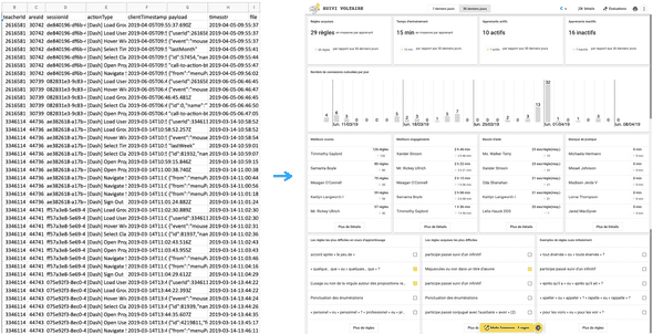 Figure 3: Example of a dashboard emphasizing raw learning data through visual encoding Progdash —(
Ez-zaouia, Tabard, & Lavoué, 2020
).
Figure 3: Example of a dashboard emphasizing raw learning data through visual encoding Progdash —(
Ez-zaouia, Tabard, & Lavoué, 2020
).
Dashboards emphasize visual encoding. As Figure 3 portrays, data visualization is at the heart of dashboard design and use. Data in dashboards are abstracted using verbals text, numbers, and graphics, but with more emphasis on graphics so as to capitalize on human perceptual and cognitive abilities for processing visual information. To that end, along with verbals and numbers, data need to be mapped effectively to graphical elements and properties ( Cleveland & McGill, 1984 ). Point, line, surface, and volume are the basic graphical elements that can be used and combined to create visual forms. Position, size, color, orientation, texture, and shape are graphical properties that can be used to decorate visual forms.
Dashboards put forth glanceable readings. This is important as the essence of dashboards is to emphasize key indicators by compacting the required all related and relevant, information in a small amount of visual space to inform the audience in a meaningful, efficient, and actionable way at-a-glance. A dashboard serves its purpose well when it fits into a single screen, that is, viewers do not have to scroll or switch between different screens to grasp the needed information. In the former case , we exceed the viewport of the viewer by expanding the boundaries of the dashboard; and in the latter case , we fragment the information and perhaps its context too. In both cases, we hamper the perceptual and communicative intent of the dashboard.
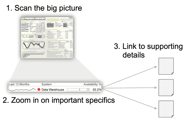 Figure 4: Overview, detail on demand
(
Few, 2013
).
Figure 4: Overview, detail on demand
(
Few, 2013
).
Dashboards facilitate drilling up and down. Few’s definition can be seen as restrictive as it requires a dashboard to fit a single display ( Few, 2006 ). However, Few’s definition aims at overcoming poor dashboard design by delivering the needed information in a way to catch viewers’ attention at a first glance. As Figure 4 portrays, dashboards build fundamentally upon the mantra: “overview first, zoom and filter, then details on demand” ( Shneiderman, 2003 ). In the overview: viewers get the intended message directly at-a-glance without overwhelming actions or distractions. Interaction methods can then be used to let the viewer examine in more detail specific aspects and different levels of data presented on the dashboard. This can be achieved through navigation and drilling up and down.
Dashboards fit a wide range of audience. Dashboard simplicity is intentional to support a wide range of different users with different data, visuals, and analytic literacy. That is, users can interact with dashboards through aggregation, filtering, searching, drilling up and down to make use and sense of the information presented ( Sarikaya, Correll, Bartram, Tory, & Fisher, 2018 ). However, unlike visual analytics, dashboards do not require end users to engage in active analytical interaction with data, for example, to explore and confirm hypotheses, categorize and identify interesting features of data for further examination ( Vieira, Parsons, & Byrd, 2018 ; Thomas & Cook, 2006 ).
Dashboards leverage human informed judgment. As information-driven tools, design and use of dashboards are, importantly, both: “open” and “slow”. Dashboards are open in the sense of their informative design, while they are slow as they are not primarily designed to do things “fast” or to perform productivity. Instead their use is more tailored to foster data sense-making, hence, falling into what is known as the slow category technology ( Hallnäs & Redström, 2001 ). As such, dashboards aim at leveraging human perceptual and cognitive abilities of processing information to help users visually explore data of interest, reason about and make sense of what they see, help guide them towards effective informed decisions, actions, learning, communication, awareness, and reflection ( Brath & Peters, 2004 ; Sarikaya, Correll, Bartram, Tory, & Fisher, 2018 ).
Adoption —Facilitating Data-driven of Everyday Practices
Dashboards are now widespread in society. Their interesting features, highlighted above, make them promising tools for harnessing data to support different day-to-day practices for non-experts ( Sarikaya, Correll, Bartram, Tory, & Fisher, 2018 ). Academia is not exception when adopting information dashboards. Schools tend most to lower barriers for teachers’ adoption of technology for their classrooms ( Millar, 2013 ; Buabeng-Andoh, 2012 ; Technavio, 2016 ). Recently, for instance, 71% of surveyed faculties were willing to adopt online materials if they are of high quality and affordable ( Consortium, 2016 ). However, education technology is not without limitations or drawbacks, a problem that has not gone unnoticed by researchers.
In fact, the increased mixing of digital and traditional classrooms has highlighted several challenges for making technology work to its best in everyday learning. For example, understanding learners’ state of learning online and devising informed interventions to best engage, coach, and support them when using online learning materials continue to be some of the major issues facing this learning medium ( Onah, Sinclair, & Boyatt, 2014 ; Lee & Choi, 2010 ). Fortunately, use of technology yields important streams of traces that can provide valuable insights if captured and made available to underlying users.
By early 2000, formal data-driven approaches to support informed decisions, assessments, and communication were finding their way in educational contexts, with the goal of harnessing and learning from generated and collected data. The line of reasoning is, in part, to improve teaching and learning outcomes by providing meaningful and actionable data-informed insights to the underlying stakeholders, such as teachers, learners, advisors, administrative staff members, and course designers ( Siemens & Long, 2011 ). Also, in part, a more longitudinal and holistic ambition is actually to understand learners’ behaviors, interactions, progress, and process, to provide continuous knowledge about learners’ state of learning and skills, and to transfer knowledge from one session to another, from grade to grade, and from one setting to another ( Siemens & Baker, 2012 ).
Introducing Learning Analytics
“The data flood is here! Traditional methods of data analysis have not kept pace with the amount of data that can be collected and is being collected from educational environments today.” ( Baker, Duval, Stamper, Wiley, & Shum, 2012, p. 2 ).
Schools are increasingly deploying learning management systems to deliver course contents online ( Paulsen, 2003 ). Self-paced learning environments and intelligent tutoring systems are also becoming popular in classrooms ( Adkins, 2018 ; Mamun, Lawrie, & Wright, 2016 ; Kulik & Fletcher, 2015 ). Moreover, massive open online course platforms, e.g., Edx, Coursera, Khan Academy, as well as paid ones, e.g., Udacity, Udemy, Lynda are being increasingly adopted by leaners for both formal and non-formal education and training ( Crues et al., 2018 ). Learners step through different materials on such platforms, leaving behind important learning traces stored on a daily basis by server logs, which can provide valuable insights into learners’ behaviors, process, progress, and skills.
The blending of classrooms with digital learning tools and materials, as well as the resulting challenges of harnessing technology to best fit a complex learning and teaching environment, led to the increase in education data-analytics. Research fields, such as Educational Data Mining and Learning Analytics and Knowledge, emerged. The international society of educational data-mining defines this field as: “an emerging discipline, concerned with developing methods for exploring the unique types of data that come from educational settings, and using those methods to better understand learners, and the settings which they learn in” ( Siemens & Long, 2011 ). Siemens et al., defined the field of learning analytics as: “the measurement, collection, analysis and reporting of data about learners and their contexts, for purposes of understanding and optimizing learning and the environments in which it occurs” ( Siemens & Long, 2011 ).
The overview of the work of education data-analytics communities is structured around: the what, e.g., data, environments; why, e.g., monitoring, analysis, prediction, intervention, tutoring, mentoring, assessment, feedback, recommendation; who, e.g., learner, teacher, advisor, course designer; how, e.g., statistics, data mining, machine learning, visualizations ( Chatti, Dyckhoff, Schroeder, & Thüs, 2012 ; Pe∼na-Ayala, 2018 ). Although both educational data-mining and learning analytics communities work towards improving learning and teaching by assessing data, it is worth noting that they have different approaches, i.e., in terms of why and how, for achieving these shared objectives. The key distinction is that the former places “greater focus on automated discovery”, i.e., focuses on methods for making and automating discoveries, while the latter places “greater focus on leveraging human judgment” through reporting tools and visualizations ( Siemens & Baker, 2012 ), i.e., focuses on the process of collecting, analyzing, measuring, and reporting insights to help underlying stakeholders make use and sense of data, and guide them in making informed decisions.
Harnessing Learning Data
Learning analytics rely on data or, more specifically, learning traces timestamped click-stream logs, and other learners’ related data bodily signals, self-reported data, grading etc., to improve teaching and learning. For example, learners’ use of learning management systems results in collecting large amounts of data about learners’ actions, quiz completions, learning artifacts ( Paulsen, 2003 ). Enrollment into massive online courses leads to collecting demographic information, action logs about video and exercise navigation, quiz performance, forum discussions ( Crues et al., 2018 ). Similarly, the increase in self-paced learning environments results in collecting learners’ actions, errors, struggles, attempts, moments of idle ( Adkins, 2018 ; Mamun, Lawrie, & Wright, 2016 ).
Given the complex nature of learning and teaching, often it is difficult or insufficient to rely on one modality, e.g., logs, to provide insights into learners’ states of learning. One of the ambitious goals of learning communities is to collect and use different modalities also referred to as multimodal analytics, such as using video, audio, gestures, emotions, logs, cognition loads, among others, to characterize, design, and study learning and teaching in a holistic way ( Worsley & Martinez-Maldonado, 2018 ).
In the same way, such modalities are often longitudinal with longer time frames, and are complex and heterogeneous, thus making it difficult to mine for utility purposes using traditional methods and tools, e.g., spreadsheets. Furthermore, teachers, learners, and school staff members face barriers when using data in their workplaces by themselves, including a lack of time ( Campaign, 2018 ; Sandford, Ulicsak, Facer, & Rudd, 2006 ) and data, visual, and analytic literacy to process, analyze, and make sense and use of data ( Barbara Wasson, 2015 ). There is thus a growing need for methods and tools that facilitate “translation” of learning data into actionable insights for non-experts.
Learning communities work towards building reliable methods, models, techniques, and tools to harness data for critical value ( Chatti, Dyckhoff, Schroeder, & Thüs, 2012 ; Baker & Inventado, 2014 ); starting by capturing and preparing learning traces into usable forms ( Kandel et al., 2011 ); summarizing and transforming usable traces into insightful indicators ( Sarikaya, Gleicher, & Szafir, 2018 ); then encoding those indicators into meaningful visual representations to support information-driven practices in teaching and learning settings ( Vieira, Parsons, & Byrd, 2018 ).
Leveraging Teachers and Learners Judgment
One of the key focuses of the learning community is “leveraging human judgment” through data-driven approaches and tools ( Siemens & Baker, 2012 ). The globalization of dashboards and their interesting features: emphasizing key formative, quality, and safety ensuring metrics, glanceable readings, wide audience fitting ( Sarikaya, Correll, Bartram, Tory, & Fisher, 2018 ), caught the interest of learning communities to investigate them when facilitating different kinds of information-driven applications, such as monitoring, regulation, awareness, reflection, learning, collaboration, and more ( Chatti, Dyckhoff, Schroeder, & Thüs, 2012 ; Vieira, Parsons, & Byrd, 2018 ).
In education settings, information-driven tools are roughly inspired by two approaches, namely “quantified-self” and “data-analytics”. In quantified-self, for instance, in health-care, users collect data on their own life’s habits, e.g., diet, workout, sleep; and visualizations are used to help users’ make use and sense of data and facilitate self-awareness and self-reflection. Most learning dashboards, inspired by quantified-self, are learner-centered ( Bodily et al., 2018 ; Jivet, Scheffel, Drachsler, & Specht, 2017 ), with the goal of facilitating self-monitoring, awareness, reflection, and metacognition ( duval, 2011 ; Loboda, Guerra, Hosseini, & Brusilovsky, 2014 ; Ruiz et al., 2016 ).
The data-analytics approach, on the other hand, considers that teaching and learning are complex internal processes that need to be formally informed using systematic approaches. For instance, when a teacher opts for an existing learning material or activity or updates it, how is the learning really improved, and how can such improvements best be assessed? The analytical approach aims at filling this gap by leveraging formative assessment and data-driven decision support through teacher-centered dashboards ( Black & Wiliam, 1998 ; Wayman, 2005 ; Sedrakyan, Mannens, & Verbert, 2019 ). Both movements, learner-centered and teacher-centered, have different approaches for collecting, analyzing, and designing visualizations to assist teachers and learners in emphasizing indicators about “what is doing on” to improve teaching and learning experiences and outcomes.
Teachers’ Dashboards
When drawing a parallel with traditional learning, for instance, in face-to-face, teachers frequently track and assess different cues about learners, such as participation, social and behavioral interactions, or engage directly with learners in discussions to assess their understanding and involvement with learning activities. Such cues make the state of learning visible for a teacher to devise informed interventions. In online learning, teachers and learners lack natural cues, such as gestures, facial expressions, direct contact, dialog with and feedback from others. Dashboards can compensate such vital cues of a shared context.
Ever since the increase in data-driven learning communities, dashboards have been at the forefront of digital tools, when harnessing learning traces and other learners’ related data, to improve learning and teaching. Teachers’ dashboards are a type of information dashboards ( Few, 2004 ; Sarikaya, Correll, Bartram, Tory, & Fisher, 2018 ; Smith, 2013 ) aimed at processing, summarizing and presenting meaningful, informative, quality, and safety ensuring indicators about state of learning to teachers. The simplicity of dashboard design and use, visual encoding, easy-to-read, glanceable readings, wide audience fitting, makes them a good fit when instrumenting teachers to allow in-time informed pedagogical interventions.
Early work on learning dashboards focused on instrumenting teachers with data-driven tools to support formative assessments and accountability ( Black & Wiliam, 1998 ; Wayman, 2005 ). Follow-up research focused on leveraging teachers’ judgment through reporting tools and visualizations ( Siemens & Baker, 2012 ; Verbert et al., 2014 ). Recently, a wide range of teachers’ dashboard contributions has been introduced spanning a variety of aspects.
Summary Notes
The research into dashboards could be seen as having an ambivalent audience, roles, and applications in education setting literature ( see a review,Schwendimann et al., 2017 ). Specifically, in terms of “audience”, such work can be grouped into two separate, but partially overlapping, strands.
The first strand is driven by theories and studies advocating a shift in the focus from the teacher to learners, namely constructivism in both cases: cognitive or individual informed by Piaget’s theory and/or social informed by Vygotsky’s theory ( Kalina & Powell, 2009 ). In this model of learners-centered learning, learners are the active actors in the process of developing, constructing, and acquiring knowledge along the way. Several dashboards have been designed to instrument learners in facilitating self-monitoring, awareness, reflection, and meta-cognition (( see reviews,Bodily et al., 2018 ; Jivet, Scheffel, Drachsler, & Specht, 2017 )).
The second strand, which is directly relevant to the work of this dissertation, focuses on empowering teachers through the design and use of dashboards to allow them to effectively conduct informed interventions. Effective teachers still play a crucial role as they are experts in the classroom’s everyday routines. They coach, inspire, challenge, motivate, and adapt to individuals, thus having an essential role in moderating and facilitating learning ( Hattie, 2012 ).
In this dissertation, we hope to narrow down the scope of teacher-facing dashboards, to identify typical practices surrounding such tools in terms of design goals and purposes, data-informed practices, evaluation, and challenges. We hope to extend our understanding of what teachers actually do with dashboards in everyday practice and in the long run, and what sociotechnical factors and pedagogical practices surround teachers’ dashboard design and use.
Consequently, we ground our approach on the assumption that we can augment and support teachers’ knowledge through insightful data reporting tools ( Baker, 2016 ; Norman, 1991 ; Siemens & Baker, 2012 ), allowing them to guide their instructions and pedagogical actions to better support learners to learn and improve. In a complex sociotechnical ecosystem of teaching and learning, we believe it is the combination of teachers’ expertise, intuitions, and data-driven insights that will most likely improve experiences and produce the best outcomes.
Monitoring Learners’ Activity
Monitoring has been well studied in organizational design ( Ouchi, 1979 ) and computer-supported cooperative work (CSCW), and has been defined as an “act of observing the actions of others to determine whether they comply with a predefined set of behaviors” ( Robert, 2016 ). This definition entails two important facts regarding the practice of monitoring: tracking and evaluation ( Kirsch, 1996 ). Tracking involves allocating expectations to members and frequently assessing their associated status: for example, a teacher may expect learners to make an agreed-upon amount of progress on a weekly basis in some topics, so s/he needs to deliberately monitor learners’ progression; also, the evaluation involves specifying a set of predefined measures to ascertain expectation status with respect to a desired set of behaviors and/or outcomes: for example, a teacher needs to lay down rules against which s/he will compare learners’ behaviors or the outcomes of their behaviors. In this respect, the aim of monitoring is to change (or regulate) individuals’ behavior, hence also referred to as behavior control ( Eisenhardt, 1985 ; Kirsch, 1996 ). The practice of monitoring is considered as effective when the individuals monitored behave as expected and comply with the predefined measures ( Robert, 2016 ; Ouchi, 1979 ). Monitoring can have crucial implications on the actions of users’ being monitored: for instance, it is shown that monitoring, i.e., when someone observes users’ actions, leads to effective communication and coordination among team members ( Dabbish & Kraut, 2008 ), improves team performance ( Marks & Panzer, 2004 ), and increases trust among users ( Robert, 2016 ).
Similarly, in online learning settings, the practice of monitoring learners’ activity can have crucial implications on learners’ progress, performance, and experience. Tools that explicitly capture, integrate, and propagate measures about learners’ state of learning can facilitate the practice of monitoring. From this viewpoint, monitoring can be performed in two main ways: through self-monitoring, learners monitor themselves with the aim of encouraging self-regulation, reflection and metacognition ( Loboda, Guerra, Hosseini, & Brusilovsky, 2014 ); and through internal (see teachers) or external (see advisors) monitoring, for example, a teacher can set objectives for learners and monitor whether learners are progressing towards achieving those objectives ( Florian-Gaviria, Glahn, & Gesa, 2013 ), a teacher can monitor learners’ engagement with the learning material to assist learners in a timely fashion ( Aslan et al., 2019 ). At workspace level, monitoring can be: synchronous, by providing real-time information to underlying stakeholders; asynchronous, by providing post-hoc information; and/or proactive, by providing anticipated information ( Rodriguez-Triana et al., 2016 ).
Proactive Monitoring
Proactive monitoring can be handy at institution level, or in major courses, see University, MOOC, where monitoring of individual (or groups of) learners could be difficult or even unpractical. In this respect, teachers and/or advisors lay down rules for monitoring in order to identify and engage with learners who fail to comply with those rules: not meeting goals, struggling, inactive, or at-risk ( Picciano, 2012 ).
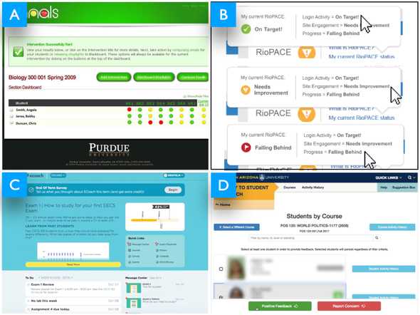 Figure 5: Examples of proactive monitoring dashboards(
(A) Signals —Arnold, 2010
;
(B) PACE —Grush, 2011
;
(C) ECoach —McKay, Miller, & Tritz, 2012
;
(D) GPS —Star & Collette, 2010
).
Figure 5: Examples of proactive monitoring dashboards(
(A) Signals —Arnold, 2010
;
(B) PACE —Grush, 2011
;
(C) ECoach —McKay, Miller, & Tritz, 2012
;
(D) GPS —Star & Collette, 2010
).
For example, the Northern Arizona University has developed Grade Performance Status (GPS), an academic alert tool designed to enhance teacher-learner monitoring by taking teachers’ inputs and turning them into personalized emails sent to learners ( Star & Collette, 2010 ), see Figure 5-(D) Similarly, Course Signals at Purdue University provides early actionable information, feedback, and interventions to learners, teachers, and advisors about learners’ progression by aggregating data from virtual learning environments, grade performance, and outside class help-seeking information, e.g., checkpoint sessions with teachers or advisors ( Arnold, 2010 ). Teachers configure thresholds to categorize learners’ progress and implement different strategies to engage with learners, e.g., signaling, traffic alike (green, yellow, and red) flags, emails, text messages, referrals to academic advisors, and face-to-face meetings, see Figure 5-(A).
Unlike Signals, where teachers set up thresholds for alerts, Rio Salado College developed a Progress and Course Engagement (PACE) system, which predicts learners’ online progress using behavioral-data (e.g., course login), online engagement (e.g., course enrollment), and progress (e.g., materials reading, course scores). PACE uses similar encoding to Signals, showing green, yellow, and red flags so that teachers can identify whether a learner is on target, falling behind, or needs help ( Grush, 2011 ), see Figure 5-(B). To keep track and provide tailored feedback to learners in major courses, E-Coach ( McKay, Miller, & Tritz, 2012 ) at the University of Michigan uses data from surveys to provide progress, grade, performance, and feedback visualizations. Teachers can reach learners using todo lists, emails, text messages, prepare and plan exams, and send motivational tips to learners, see Figure 5-(C).
The main goal of proactive monitoring is to allow teachers, advisors, and staff-members to be proactive about learners’ progression by identifying at-risk learners before they get to a critical point. Learners identified as at-risk get follow-up interventions.
Classroom Monitoring
Technology-mediated learning can accommodate teaching and learning for individual learners with different pacing, style of learning, and level of acquisition. Intelligent tutoring systems enable learners to work in a self-paced manner to learn specific concepts, e.g., maths, grammar, while also continuously adapting content and providing feedback to learners while they are learning ( D’Mello & Graesser, 2012 ; Molenaar & Campen, 2017 ). In particular, this releases teachers, allowing them to target specific learners need help to provide them with personalized aid.
However, such technologies are not without limitations due to the complex nature of human intelligence and a variety of technical reasons. To be more precise, learners get stuck, try to game the system, abuse hints, avoid hints, get bored, or even get off-task ( Baker, 2016 ). Also, in part, assessing and understanding learners’ activity when using such a technology is challenging, i.e., a teacher can, for instance, rely on one-to-one talks with learners, close monitoring, or direct watching of a screen of a learner to assess the state of learning. However, such approaches are cumbersome and time-consuming, as teachers have to target every learner in a classroom ( Holstein, McLaren, & Aleven, 2017 ).
Prior research has shown the benefits of augmenting ITS with fine grain monitoring dashboards, specifically to support teachers when informing timely interventions. For instance, monitoring has been directed at understanding learners’ progression while they are learning maths concepts using an ITS ( Molenaar & Campen, 2017 ), see Figure 6-(C). Monitoring has been tailored to track learners’ engagement when using an ITS, namely learners’ use of hints, difficulties, facial expressions, and contextual performance to distill learners’ emotional state, e.g., satisfied, confused, bored; learning status, e.g., on-task, off-task ( Aslan et al., 2019 ), see Figure 6-(B). Also, monitoring has been designed to track learners’ struggles, performance to identify ill-suited situations: hint abuse, avoidance, off-task, rapid attempt ( Holstein, McLaren, & Aleven, 2018 ), see Figure 6-(A). Similarly, monitoring has been investigated to enable teachers to track learners’ difficulties and differences when learning the C programming language ( Fu, Shimada, Ogata, Taniguchi, & Suehiro, 2017 ), see Figure 6-(D).
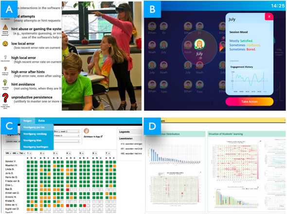 Figure 6 : Examples of classroom monitoring dashboards (
(A)Holstein, McLaren, & Aleven, 2018
;
(B)Aslan et al., 2019
;
(C)Molenaar & Campen, 2017
;
(D)Fu, Shimada, Ogata, Taniguchi, & Suehiro, 2017
)
Figure 6 : Examples of classroom monitoring dashboards (
(A)Holstein, McLaren, & Aleven, 2018
;
(B)Aslan et al., 2019
;
(C)Molenaar & Campen, 2017
;
(D)Fu, Shimada, Ogata, Taniguchi, & Suehiro, 2017
)
Retrospective Monitoring
Technology-mediated learning transforms the way teaching and learning are delivered to learners where learning is no longer bounded with physical classrooms. Since learning occurs remotely, learners’ progression, struggles, and engagement with learning content online become difficult for teachers to follow ( Turnbull, Chugh, & Luck, 2019 ).
Dashboards have been aimed at facilitating teachers’ retrospective monitoring of learners’ engagement and acquisition when using online learning materials. For example, monitoring has been designed to track learners’ interactions with learning materials to allow teachers to estimate the workload of different materials, such as the most time-consuming exercises, popular materials ( Govaerts, Verbert, & Duval, 2011 ). Monitoring has been aimed at providing teachers with a set of indicators about learners’ skills mastery, progression, time spent, and misconceptions to enable planning and conducting of personalized lessons ( Xhakaj, Aleven, & McLaren, 2017 ). Monitoring has been aimed at assessing where learners get stuck, and at identifying similar problems causing struggles, and common learning strategies in problem-solving environments ( Johnson, Eagle, & Barnes, 2013 ). Also, monitoring has been investigated to assess learners’ performance and competence acquisition with respect to specific levels set by a teacher ( Florian-Gaviria, Glahn, & Gesa, 2013 ).
Furthermore, monitoring has been investigated to facilitate assessment of learners’ behavior in online settings. For instance, monitoring has been designed to assist teachers in conducting assessments of learners’ pathways in a self-regulated social network learning environment, e.g., blogs, pages, comments, bookmarks, files ( Groba, Barreiros, Lama, Gewerc, & Mucientes, 2014 ). Monitoring has been directed to allow teachers to understand learners’ actions and engagement when engaged in mind mapping learning activities ( Carrillo, Renaud, Prié, & Lavoué, 2017 ). Similarly, monitoring has been directed to enable teachers to identify tendencies in their classes, and learners who need special attention based on learners’ access to online courses, forum discussions, and quizzes ( Mazza & Milani, 2005 ; Mazza & Dimitrova, 2007 ).
Summary Notes
We build upon this growing body of research, investigating the design of information-driven tools for monitoring, and hope to contribute in two ways.
First, although a large body of research (and reviews) has shown interest in the design of dashboards to support monitoring (( see reviews,Schwendimann et al., 2017 ; Verbert et al., 2014 )), we found there to be a lack of guidance when designing around the concept of monitoring in dashboards. Indeed, the current conceptual definitions of monitoring are limited to: “tracking learners’ activities and outcomes” ( see a review,Rodriguez-Triana et al., 2016 ), and “act of observing the actions of others to determine whether they comply with a predefined set of behaviors” ( Robert, 2016 ). This could be interpreted as a result of an established consensus among researchers and designers regarding what monitoring is. However, as underlined by different studies, monitoring seems to be a complex construct ( Robert, 2016 ; Kirsch, 1996 ). There is little insight into what information to provide teachers with to support monitoring e.g., summative, formative, behavioral, outcomes; and how to design around, e.g., exploratory, explanatory.
Second, a great deal of work on dashboards designed for monitoring goes into describing different artifacts, while this body of research demonstrates key facets of what teachers are supposed or can do with dashboards when monitoring learners. Little research is directed into investigating how monitoring through use of dashboards, moderates teachers’ and learners’ practices in real-world settings ( Schwendimann et al., 2017 ; Bodily et al., 2018 ).
We aim at providing empirical insights into both the design and use of dashboards to support monitoring. Here, we frame monitoring through the use of teachers’ dashboards as the practice of visualizing detailed status updates or audit trails about learners’ behaviors, process, progress, and/or skills to enable teachers and learners to see “what is going on” and gain insights into engaging in informed and timely actions ( Robert, 2016 ; Few, 2006 ). In the context of this dissertation, we design and conduct two studies to support teachers in monitoring learners’ emotional state. Only a few studies have focused on the impact of learners’ emotion on the pedagogical practices in educational settings (( e.g.,Ruiz et al., 2016 )). We thus adopted a top-down approach to reflect and relate what we have learned as to the design and use of monitoring dashboards with respect to current literature.
Fostering Sociotechnical Practices
From early on, research into human-computer interactions has recognized the importance of considering sociotechnical factors, either by integrating human factors into the design of interactive systems, or by capturing such factors in the surrounding of human experience when using technologies; such as affect ( Picard, 1999 ), culture ( Clemmensen & Röse, 2010 ), spirituality ( Wyche, Aoki, & Grinter, 2008 ), awareness ( Dourish & Bellotti, 1992 ), reflection ( Schön, 1983 ). Over time, specifically, awareness, reflection and socio-affect, have gained great attention in different literatures, e.g., computer-supported cooperative work/learning, and, in part, in different domains as such quantified-self, health care, education, and interactive design ( Baumer et al., 2014 ; Desmet, 2002 ). Dashboards can do more than support the activity of monitoring by fostering the human social factor. In fact, they can give meaning to everyday practice.
Facilitating Awareness of Individual and Group Activity
In physical learning spaces, for instance, in a classroom, a teacher as well as learners develop an understanding about what and how the other is doing, e.g., behavioral actions, emotional state, locations; through natural cues of face-to-face human interactions, e.g., gestures, facial expressions, direct contact, dialog, and feedback. In computer-supported cooperative work/learning, awareness plays a central role in understanding what and how others are doing in context ( Dourish & Bellotti, 1992 ; Gutwin, Stark, & Greenberg, 1995 ).
From a very early stage, awareness was investigated in cooperative work, specifically, in the context of “media space” tools, where awareness was defined as an “understanding of the activities of others, which provides a context for your own activity” ( Dourish & Bellotti, 1992p. 1 ). This definition entails two main facts for awareness: knowledge and evaluation. Knowledge involves users’ realization of the implications of their contributions in a shared context, while evaluation involves users’ assertion of their own actions with respect to the objectives of the group as a whole. Tools are considered to be effective in facilitating awareness when they provide users with suitable amounts of cues, contexts, and representations about the setting to be aware of, without overwhelming or distracting information ( Schmidt, 2002 ). Awareness can have a crucial implication on users’ knowledge and engagement, for instance, it is shown that awareness, i.e., when cues about users’ activity in a shared context, are captured and reflected back to them, facilitated coordination and communication among users ( Dourish & Bellotti, 1992 ; Buder, 2011 ), supported collaborative virtual learning among separated learners ( Gutwin, Stark, & Greenberg, 1995 ), and facilitated orchestration of classroom activities ( Alavi, Dillenbourg, & Kaplan, 2009 ; Dillenbourg et al., 2011 ).
In this regard, learning dashboards can facilitate awareness of teachers’ and learners’ online activities through cues that are captured and made available to them. Users, then, can seamlessly monitor such cues, i.e., visualizing, reading, observing, so as to gain an understanding and ascertain the state of the setting to be aware of. For instance, in synchronous settings, awareness cues can improve group dynamics during collaboration through immediate feedback information about users’ interactions made available to the group in real-time ( Tausczik & Pennebaker, 2013 ; Calacci, Lederman, Shrier, & Pentland, 2016 ). Similarly, dashboards can also improve teachers’ awareness of social interactions among learners online: social participation in forum discussions, group work, chats ( Groba, Barreiros, Lama, Gewerc, & Mucientes, 2014 ; Yasar & Karadeniz, 2019 ); they can foster teachers’ awareness of learners’ emotions or the emotional climate of the classroom with respect to different learning activities ( Ruiz et al., 2016 ; Aslan et al., 2019 ); teachers’ awareness of cognitive aspects of learners when using online materials: struggles, workloads, time spent ( Dyckhoff, Zielke, Bültmann, Chatti, & Schroeder, 2012 ; Govaerts, Verbert, & Duval, 2011 ); teachers’ awareness of ill-suited behavioral interactions of learners’ online: gaming materials, rapid attempts, hint avoidance or abuse ( Holstein, McLaren, & Aleven, 2018 ; Mazza & Dimitrova, 2007 ). These are examples of teachers’ awareness of the status and progress of learners when they are engaged with online materials through the use of dashboards.
Fostering Socio-affective Relationships
Over the last decade, researchers in the educational field have showed an interest in emotions. Several studies have shown that emotions have a strong effect on people’s experiences and well-being ( Pekrun, 2006 ; Boekaerts, 2010 ; D’Mello, 2017 ), and underscore a key role of emotions in learning, regulation processes, as well as a strong link to motivation and achievement ( Boekaerts, 2010 ; Pekrun, 2006 ; Mega, Ronconi, & Beni, 2014 ; lavoue_reflection). In fact, emotional information can provide cues to enhance learners’ learning ( Linnenbrink-Garcia, Patall, & Pekrun, 2016 ). D’Mello et al., further argues that “given the central role of emotions in learning, attempts to analyze (or data mine) learning without considering emotion will be incomplete” ( D’Mello, 2017 ). That is, learning is more likely to be successful when teachers, as well as learning platforms, help minimize negative emotions (e.g., confusion, boredom, fear, frustration, stress) and facilitate positive ones (e.g., happiness, enjoyment, pride). Designing tools that foster positive emotional awareness among teachers and learners is a key issue for information-driven learning communities ( Bouvier, Sehaba, & Lavoué, 2014 ). Emotion awareness refers to the ability to perceive, identify, and understand emotions ( Boden & Thompson, 2015 ), which can be achieved through tools that capture and make available such cues. Much work on tools and environments in learning settings, which captures and integrates learners’ emotions, can be grouped into two separate strands.
The first strand aims at enhancing learning through the design and use of “emotion-aware” learning technologies, which detect and respond to learners’ emotional states by providing contextual feedback or intervening in the learning process ( D’Mello, 2013 ). For example, Affective AutoTutor is an intelligent tutoring system that integrates learners’ emotional state alongside the cognitive state while they are learning physics, so as to engage them with the materials being learnt through human-like interactions ( D’Mello & Graesser, 2012 ).
The second strand, which is directly connected to the work in this thesis, aims at capturing and reflecting back emotion cues to users to support emotional awareness and human-informed interventions. Recent research is still emerging on this topic. Dashboards have been directed to capture and present learners’ self-reported emotions to support their emotional awareness( Ruiz et al., 2016 ). Rather than using subjective (or self-reported) emotions, other dashboards have proposed an automated approach to infer learners’ emotions online, for instance, using textual cues ( Montero & Suhonen, 2014 ), learners’ action logs ( Leony, Mu∼noz-Merino, Pardo, & Kloos, 2013 ), and video cues ( GhasemAghaei, Arya, & Biddle, 2016 ).
Supporting Teachers’ and Learners’ Reflection
Reflection in interactive design is informed from different domains: philosophy, cognition, psychology, and education ( Baumer, 2015 ). Schön, for instance, defined reflection as the practice by which we gain evidence from our experiences and become aware of our implicit knowledge ( Schön, 1983 ). In light of Schön’s definition, reflection can be seen as a process of introspection and analysis in which users generate, question, and interpret different aspects of their activities, and project that understanding into the future ( Dourish, 2004 ). From this perspective, reflection can materialize through both cognitive practices and social interactions ( Mols, van den Hoven, & Eggen, 2016 ).
The practice of reflection can happen naturally, for instance, during moments of introspection and/or socialization, such as talks with a friend. However, for most people, reflection is initiated through (external) contextual cues and factors, mainly through use of technology also referred to as information-driven reflection, or through concrete verbal or written dialogs, e.g., discussion with a mentor, a psychologist also referred to as dialog-driven reflection, ( Mols, van den Hoven, & Eggen, 2016 ). The former case is directly relevant to our work as it deals with users’ reflection through use of data-driven tools. In fact, as stated by Mols et al., technology plays three roles for reflection: “triggering” provokes a reason to initiate reflection, e.g., on some content or information, historical events; “supporting” facilitates the execution of the reflection process, e.g., allowing users to explore and inspect information on their activities from different perspectives; and “capturing” facilitates externalization of reflections, e.g., through use of diaries to document moments of reflections; together, these roles bridge the process of reflection of everyday practice, or as stated, assist in: “remembering and analyzing past, present and future experiences in order to reassess our perceptions, beliefs, feelings, and actions regarding our everyday life” ( Mols, van den Hoven, & Eggen, 2016 ). Reflection, then, facilitates inspections of information of interest to produce a deep understanding and knowledge and better actions, for instance, better behavioral change and well-being ( Mols, van den Hoven, & Eggen, 2016 ), reinforcement of learning ( Norman, 1993 ).
Dashboards by their very nature are information-driven tools. This, in part, leverages human exploration and interpretation of the information presented on dashboards. As a result, dashboards could provide great space for reflection. For instance, through dashboards a teacher might be able to explore and assess learners’ states of learning from different perspectives: behaviors, progress, process, and skills, which can then “trigger” reflection and “support” its process ( Mols, van den Hoven, & Eggen, 2016 ). Few papers have reported how the dashboard supported teachers’ reflection, by assessing outcomes seemingly resulting from reflection, for instance, the ability to identify opportunities for interventions in a classroom ( Molenaar & Campen, 2017 ), to identify parts that need more focus in the classroom ( Chetlur et al., 2014 ) or parts that need to be improved to support learners’ comprehension ( Xhakaj, Aleven, & McLaren, 2017 ), to understand the way teachers prepare and run their courses ( Mazza & Dimitrova, 2007 ).
Summary Notes
We seek to build upon this great body of research investigating the design of information-driven tools to foster awareness and reflection, and we hope to contribute in three ways.
First, it is worth noting that the large majority of learning dashboards rely on server logs and that few papers design dedicated probes to capture and present relevant information to support awareness, emotional awareness, and reflection ( Schwendimann et al., 2017 ). Indeed, we found there to be a need for, or as stated: “a much richer set of relevant data” to foster awareness and reflection about learning ( Verbert et al., 2014 ; Rodriguez-Triana et al., 2016 ).
Second, several papers aim at supporting teachers’ awareness and/or reflection of various factors including social ( Groba, Barreiros, Lama, Gewerc, & Mucientes, 2014 ; Yasar & Karadeniz, 2019 ), emotional ( Ruiz et al., 2016 ; Aslan et al., 2019 ), and behavioral ( Holstein, McLaren, & Aleven, 2018 ) factors. However, one crucial mismatch persists between supporting awareness or reflection through dashboards, and the focus of the evaluations. Very few papers have reported on awareness and/or reflection per se. Indeed, “few studies actually look at how (or how much) [to what extent] awareness and/or reflection are improved or, more importantly, what are the effects of such enhancements” ( refer to a review,Rodriguez-Triana et al., 2016 ).
Third, tools are considered effective in supporting awareness and/or reflection when they provide users with the right information, at the right time, and through the right representation. That is, too little information might induce a lack of knowledge about the setting, while too much information might overwhelm, distract, and hamper ease of use of the tool. Indeed, there is little insight into what information should be provided to teachers to support awareness and/or reflection, how it can be provided, and how to design around such concepts ( Rodriguez-Triana et al., 2016 ).
We aim at providing empirical insights into how dashboards might support teachers’ awareness and understanding of individual (or a group of) learners’ activities, and emotional states, as well as how dashboards might trigger and support teachers’ reflection.
Evaluating Teachers’ Dashboards
Approaches for evaluating teachers’ dashboards are mostly informed by methods for evaluating interactive systems. New evaluation approaches, such as user experience (UX), aim at capturing both the pragmatic and hedonic aspects involving users’ subjective perception and responses that result from the use and interaction with interactive tools ( Bargas-Avila & Hornbæk, 2011 ). However, usability and usefulness are still widely adopted when evaluating interactive systems ( Hornbæk, 2010 ).
Usability has different attributes focusing on evaluating whether a system is “easy to use”. Early work on usability focused on developing accurate and generable methods, for instance, by gathering systematic performance data about users’ use of a tool, for example, using questionnaires, such as Questionnaire for User Interface Satisfaction (QUIS) ( Chin, Diehl, & Norman, 1988 ), Computer Usability Satisfaction Questionnaires ( Lewis, 1995 ), and System Usability Scale (SUS) ( Brooke & others, 1996 ). Although important, ease of use is not the only factor to evaluate a system, or as stated, “if ease of use was the only valid criterion, people would stick to tricycles and never try bicycles” ( Beale, 2007 ).
Follow-up research focused on developing formative usability evaluation using methods such as focus group, user observation, think-aloud, heuristics, cognitive and pluralistic walkthrough. Related research has looked beyond usability, yielding new concepts for evaluation of interactive systems such as, usefulness ( Hornbæk, 2010 ) and aesthetics ( Hartmann, Sutcliffe, & De Angeli, 2007 ). Although there is little consensus and formal methods on how to evaluate whether a system is useful, researchers assume that usefulness depends on the real-world context in which a system is deployed and used by end-users ( Macdonald, 2012 ).
Recently, a wide range of dashboard contributions has been introduced to instrument teachers using dashboards, spanning a variety of technical and pedagogical aspects. A notable amount of teacher-facing dashboard contributions is still system-oriented, where the paper describes the newly created dashboard artifact and highlights how teachers are supposed to (or can) use it ( Mottus, Kinshuk, Graf, & Chen, 2014 ; De, Ryberg, Dawson, & Bakharia, 2010 ; Bakharia & Dawson, 2011 ; Gruzd & Conroy, 2018 ; Mazza & Milani, 2005 ; Fu, Shimada, Ogata, Taniguchi, & Suehiro, 2017 ). Other papers, discussed below, looked beyond the system and its underlying technology to evaluate the implications on teachers.
Evaluating Usability and Usefulness
In eLAT ( Dyckhoff, Zielke, Bültmann, Chatti, & Schroeder, 2012 ), the authors conducted controlled usability testing to evaluate the dashboard. For this purpose, four teachers were asked to perform certain tasks using the think-aloud method ( Lewis, 1982 ), which allowed the authors to pinpoint some usability issues. In a similar vein, the authors of SOLAR ( Florian-Gaviria, Glahn, & Gesa, 2013 ) conducted a task-oriented analysis to evaluate the usability of the system. However, unlike ( Dyckhoff, Zielke, Bültmann, Chatti, & Schroeder, 2012 ) where the formative think-aloud method was used, the authors administered a questionnaire to gather systematic performance results from 20 teachers.
In InVis ( Johnson, Eagle, & Barnes, 2013 ), the authors developed 15 tasks covering different features of the tool that they combined with a usability questionnaire CSUQ ( Lewis, 1995 ), to conduct quantitative task-based usability testing with seven participants. In SoftLearn ( Groba, Barreiros, Lama, Gewerc, & Mucientes, 2014 ), the authors used the same questionnaire, i.e., CSUQ, as in InVis ( Johnson, Eagle, & Barnes, 2013 ). However, this time they conducted an A/B testing approach where one teacher used the learning environment without the dashboard (control) and another teacher used the learning environment alongside the dashboard (treatment). It was observed from this that the dashboard was helpful in reducing the assessment time of learners’ learning.
Some of the aforementioned papers looked beyond usability. For instance, the authors of SOLAR ( Florian-Gaviria, Glahn, & Gesa, 2013 ) administered a custom questionnaire to gather insights into the usefulness of their dashboard. It was observed that the tool was useful for around three quarters of 20 teachers, to identify patterns of failure and success in learners’ learning, to trigger reflection and awareness, and to understand learners’ social behavioral aspects. In InVis ( Johnson, Eagle, & Barnes, 2013 ), the authors conducted a set of case studies with expert teachers, to show how the tool was useful for developing insights into learners’ common strategies and mistakes in problem-solving environments. Similarly, the authors of SAM ( Govaerts, Verbert, & Duval, 2011 ) conducted two case studies with 20 teachers using questionnaires, where it was found that the dashboard helped teachers to identify outlier learners that needed assistance, and to understand the workload of the course on learners online.
Evaluating Pedagogical Practices
Another perspective in the evaluation of teachers’ dashboards concerns deploying the dashboard for teachers, to gather insights into the pedagogical practices that the tool might enable or limit in real-world settings. Research into teachers’ data-informed practices using dashboards focuses mainly on how to support monitoring of learners’ performance while they are using a learning environment in-class, such as errors, struggles, attempts, responses, and engagement indicators.
Combining field observations and interviews, Molenaar and Campen looked into how 38 teachers used a dashboard over one session (50 minutes) to conduct assessments both at class and learner levels (errors, progression, etc.), to provide motivational and formative instruction to learners, as well as to adjust both the learning material and the pace of the lesson. Although the results revealed a diversity of use (low, medium, high), three-quarters of teachers’ dashboard consultations were followed by motivational feedback or formative instruction, either directed to the class as a whole or to individual learners with medium or high ability ( Molenaar & Campen, 2017 ). In a similar study, Holstein et al., investigated how 8 teachers used a virtual reality glass dashboard over a total of 18 courses (30 minutes each) to orchestrate the classroom ( Holstein, McLaren, & Aleven, 2018 ). In contrast to ( Molenaar & Campen, 2017 ), the authors found that the dashboard tended to divert teachers’ attention and time towards learners of lower prior ability.
Combining observations and interviews, Aslan et al., looked into how a teacher used indicators of learners’ engagement shown on a dashboard over two courses (80 minutes each) to support learners through different teachers’ interventions: verbal warning, positive reinforcement, scaffolding, close monitoring ( Aslan et al., 2019 ). The authors observed a medium-sized effect of the dashboard on teachers’ scaffolding interventions and use for close monitoring, mainly in assisting the teacher by allocating time to learners who need most support without compromising the overall experience of the class. In a similar study, Martinez-Maldonado et al., investigated how three teachers used real-time notifications on learners’ actions and their learning artifacts, shown on a dashboard ( Martinez-Maldonado, Clayphan, Yacef, & Kay, 2015 ). The dashboard was found to be helpful for teachers in orchestrating multi-tabletop learning environments and providing feedback to learners.
In a similar vein, Groba et al., proposed an analytics-based tool to help teachers assess learners’ activity, and evaluated it with two teachers during a one-session course ( Groba, Barreiros, Lama, Gewerc, & Mucientes, 2014 ). The results showed that this tool reduced assessment times significantly and helped teachers understand the learning process of learners. Combining think-aloud and observations, Xhakaj et al., investigated how five teachers used a dashboard to plan and conduct lessons over eight courses (60 minutes each), where students used a virtual learning environment ( Xhakaj, Aleven, & McLaren, 2017 ). The authors found that the provision of both positive and negative notifications on learners’ status facilitated the dialog between a teacher and learners, and supported teachers in adjusting and orchestrating learning materials. The authors also observed that the dashboard helped teachers update (confirm, reject, and/or add new items) their knowledge about both the class as a whole and individual learners. In particular, the authors found that teachers mostly integrated the knowledge acquired as to where learners struggle in their lessons.
Summary Notes
We seek to build upon this body of literature, focusing specifically on how dashboards can inform teachers’ pedagogical practices in authentic settings, and we hope to contribute in three main ways. First, although the aforementioned studies shed light on the usefulness of some aspects of the design and intelligibility of dashboards in assisting teachers, they mainly focus on evaluating technical aspects of the underlying systems ( Schwendimann et al., 2017 ). Much work on dashboards focuses mainly on implementation of interoperable architectures ( Dyckhoff, Zielke, Bültmann, Chatti, & Schroeder, 2012 ), development through toolkits ( Kitto, Cross, Waters, & Lupton, 2015 ), data aggregation from multiple learning platforms ( Mottus, Kinshuk, Graf, & Chen, 2014 ), personalization of views ( Dyckhoff, Zielke, Bültmann, Chatti, & Schroeder, 2012 ; Mottus, Kinshuk, Graf, & Chen, 2014 ; Florian-Gaviria, Glahn, & Gesa, 2013 ), usability of the dashboard ( Chetlur et al., 2014 ; Dyckhoff, Zielke, Bültmann, Chatti, & Schroeder, 2012 ; Ez-zaouia & Lavoué, 2017 ), usefulness of the dashboard ( Florian-Gaviria, Glahn, & Gesa, 2013 ; Dyckhoff, Zielke, Bültmann, Chatti, & Schroeder, 2012 ), or interoperability of the dashboard with multiple platforms ( Dyckhoff, Zielke, Bültmann, Chatti, & Schroeder, 2012 ). Also, in many cases the evaluation was conducted in controlled settings or even in the lab ( Mazza & Dimitrova, 2007 ); there is little evidence about the impact of dashboards on teachers’ practices in-situ.
Second, there are few notable studies that show that dashboards when they are well crafted, can successfully assist teachers in monitoring learners and conducting informed interventions ( Aslan et al., 2019 ; Holstein, McLaren, & Aleven, 2017 ; Martinez-Maldonado, Clayphan, Yacef, & Kay, 2015 ; Molenaar & Campen, 2017 ). However, the studies that do exist focus almost entirely on specific intelligent tutoring systems used mostly by teachers synchronously inside the classroom while learners are using the virtual learning environment. We aim at extending our understanding of how a dashboard can inform teachers’ practices in the wider perspective of web-based online learning settings.
Third, very few studies have focused on teachers’ routines surrounding such tools ( Greiffenhagen, 2011 ), or on how they help teachers inform their pedagogical practices. Also, such studies are often conducted in controlled settings, e.g., simulated classrooms ( Aslan et al., 2019 ; Holstein, McLaren, & Aleven, 2017 ) and over a short-term deployment. In contrast, we aim to examine how teachers make use of dashboards in their everyday practices, in other words, not only what teachers are supposed to do with such tools, but more importantly what teachers actually do do. To that end, we designed and conducted two of the first longitudinal studies, in-the-wild, to investigate how a dashboard might impact teachers’ pedagogical practices in the long run in authentic settings.
Dashboard Design and Use
Dashboard design can be seen as a process that includes requirement gathering, ideation, development, and evaluation. In the design process, we link research questions of interest with design ideas, act on those ideas to generate design approximations, and refine those approximations to uncover a solution that meets end-users’ needs.
Learning communities have demonstrated significant interest and adoption of dashboards to support a wide range of aspects: data sense-making, communication, learning, collaboration, awareness, reflection ( Sarikaya, Correll, Bartram, Tory, & Fisher, 2018 ; Verbert et al., 2014 ). While these contributions highlight an interesting, challenging, and interdisciplinary area of research, there continues to be a lack of guidance in grounding the design of dashboards to support such complex design goals. In fact, the literature on design-based research and practices of design, analysis, and evaluation of teachers’ dashboards is unfortunately very scarce, with only very few exceptions. In two recent systematic reviews of more than 150 learning dashboards, almost half of the surveyed papers do not conduct any evaluations or report on conducting a specific or using an existing, design process ( Schwendimann et al., 2017 ; Bodily et al., 2018 ). The first welcome exception is the framework proposed by Verbet et al., to guide the analysis of learning analytics dashboards ( Verbert et al., 2014 ). Although the framework is an excellent thinking tool, to evaluate the impact of a dashboard (e.g., see ( Molenaar & Campen, 2017 )), it mainly captures the evaluation part, and fails to provide a full model of how to design dashboards, guiding the whole process from domain characterization to evaluation. Another welcome exception is the four-stage workflow (problem identification, low-fidelity prototyping, high-fidelity prototyping, pilot studies) by Martinez-Maldonaldo et al., which aims at guiding the design and deployment of awareness tools for instructors and learners ( Martinez-Maldonaldo et al., 2015 ). However, the workflow does not shed light on the principles of dashboard design as information-driven visualization tools, and nor does it tackle the sociotechnical factors, pedagogical practice, or design tensions surrounding dashboards.
Building upon this body of design-based research and practices of design, analysis, and evaluation of teachers’ dashboards, we hope to make one major contribution.
First, research into learning dashboards continues to be somewhat disjointed, demonstrating different types of dashboards and spanning various applications, such as understanding collaboration, forum discussions, facilitating monitoring, fostering awareness and reflection, informing interventions ( Rodriguez-Triana et al., 2016 ). Dashboards are, in fact, special types of information-driven visualization tools involving complex and ill-defined tasks: data sense-making, monitoring, awareness, exploration, explanation ( Verbert et al., 2014 ); they still need to foster learning ( Ferguson, 2012 ; Chatti, Dyckhoff, Schroeder, & Thüs, 2012 ); they need to fit different users who inevitably have different needs and contexts of use ( Schwendimann et al., 2017 ; Vieira, Parsons, & Byrd, 2018 ), as well as different visual, analytical, and data literacy ( Sarikaya, Correll, Bartram, Tory, & Fisher, 2018 ; Barbara Wasson, 2015 ).
Second, in addition to the design challenges: ill-defined and complex tasks, different contexts of use, users with diverse data, visual, and analytical literacy; learning dashboards involve profound sociotechnical factors: reflection, transparency, control, trust, reliance; and pedagogical practices, such as coaching, mentoring, guiding, intervening, e.g., feedback, debrief, scaffold, lesson. A conceptual grounding of sociotechnical factors, pedagogical practices, and design challenges might prove useful in understanding how best to design around dashboards for teachers and what tensions might exist with particular designs ( Schwendimann et al., 2017 ; Vieira, Parsons, & Byrd, 2018 ; McKenney & Kali, 2017 ).
Therefore, articulating a larger conceptual umbrella under which research surrounding learning dashboards operates, in terms of what (decisions), why (rationales), and how (process) to structure and guide dashboard design, may provide a holistic view of the design process, the design implications, and the design space and facilitate a deep consideration and/or engagement with the important sociotechnical factors and pedagogical practices underpinned by teachers’ dashboard design and use, in a comprehensive and methodological way.
Summary
Analysis of prior work on teachers’ dashboards suggests there are three main issues, which corroborates the results of recent reviews on learning dashboards:
First, from a design perspective, there is a growing need for design-based research centered around needs of teachers in-situ ( Shum, Ferguson, & Martinez-Maldonado, 2019 ), to best facilitate pedagogical practices through dashboards that are more than simple log-driven summarization metrics ( Verbert et al., 2014 ; Schwendimann et al., 2017 ; Bodily et al., 2018 ).
Second, from an empirical perspective, there is a need for longitudinal studies to understand how teachers appropriate, leverage, and shape their pedagogical practices around dashboards in the long run: in other words, not only what teachers are supposed to do or can do with dashboards, but more importantly what they actually do do ( Verbert et al., 2014 ; Schwendimann et al., 2017 ; Bodily et al., 2018 ).
Finally, from a methodological perspective, much work on teachers’ dashboards continues to be somewhat disjointed. There is still a need for conceptual studies to facilitate consideration and engagement with important, while complex, design challenges, sociotechnical factors, and pedagogical practices underpinned by teachers’ dashboard design and use ( Schwendimann et al., 2017 ; McKenney & Kali, 2017 ; Vieira, Parsons, & Byrd, 2018 ).
We first took a bottom-up approach by working with underlying stakeholders to prototype and study teachers’ dashboards in context. We present, in and , two longitudinal studies of dashboards conducted in authentic settings to assist teachers in the context of online language learning.
We then took a top-down approach to structure, discuss, and reflect on our studies into teachers’ dashboards to relate what we have learned to the design and evaluation of teachers’ dashboards with respect to current research. We then discuss and present in a conceptual umbrella under which research surrounding learning dashboard design and use may operate.
References
- Adkins, S. S. (2018). The 2018-2023 Global Game-Based Learning Market. Serious Play Conference. Retrieved from https://seriousplayconf.com/wp-content/uploads/2018/07/Metaari\textbackslash_2018-2023\textbackslash_Global\textbackslash_Game-based\textbackslash_Learning\textbackslash_Market\textbackslash_Executive\textbackslash_Overview.pdf↩
- Alavi, H. S., Dillenbourg, P., & Kaplan, F. (2009). Distributed Awareness for Class Orchestration. In Proceedings of the 4th European Conference on Technology Enhanced Learning: Learning in the Synergy of Multiple Disciplines (pp. 211–225). Nice, France: Springer-Verlag. https://doi.org/10.1007/978-3-642-04636-0_21↩
- Arnold, K. (2010). Signals: Applying Academic Analytics. EDUCAUSE Quarterly, 33.↩
- Aslan, S., Alyuz, N., Tanriover, C., Mete, S. E., Okur, E., DMello, S. K., & Esme, A. A. (2019). Investigating the Impact of a Real-Time, Multimodal Student Engagement Analytics Technology in Authentic Classrooms. In Proceedings of the 2019 CHI Conference on Human Factors in Computing Systems - CHI 19. ACM Press. https://doi.org/10.1145/3290605.3300534↩
- Baker, R. S. (2016). Stupid Tutoring Systems, Intelligent Humans. International Journal of Artificial Intelligence in Education, 26(2), 600–614. https://doi.org/10.1007/s40593-016-0105-0↩
- Baker, R. S., Duval, E., Stamper, J., Wiley, D., & Shum, S. B. (2012). Educational Data Mining Meets Learning Analytics. In Proceedings of the 2nd International Conference on Learning Analytics and Knowledge (p. 20). Vancouver, British Columbia, Canada: Association for Computing Machinery. https://doi.org/10.1145/2330601.2330613↩
- Baker, R. S., & Inventado, P. S. (2014). Educational Data Mining and Learning Analytics. In Learning Analytics (pp. 61–75). Springer New York. https://doi.org/10.1007/978-1-4614-3305-7_4↩
- Bakharia, A., & Dawson, S. (2011). SNAPP: A Bird’S-Eye View of Temporal Participant Interaction. In Proceedings of the 1st International Conference on Learning Analytics and Knowledge (pp. 168–173). Banff, Alberta, Canada: ACM. https://doi.org/10.1145/2090116.2090144↩
- Barbara Wasson, C. H. (2015). Data Literacy and Use for Teaching (pp. 56–40). Taylor &Francis. https://doi.org/10.4324/9781315777979↩
- Bargas-Avila, J. A., & Hornbæk, K. (2011). Old Wine in New Bottles or Novel Challenges. In Proceedings of the 2011 Annual Conference on Human Factors in Computing Systems - CHI 11. ACM Press. https://doi.org/10.1145/1978942.1979336↩
- Baumer, E. P. S. (2015). Reflective Informatics: Conceptual Dimensions for Designing Technologies of Reflection. In Proceedings of the 33rd Annual ACM Conference on Human Factors in Computing Systems (pp. 585–594). Seoul, Republic of Korea: Association for Computing Machinery. https://doi.org/10.1145/2702123.2702234↩
- Baumer, E. P. S., Khovanskaya, V., Matthews, M., Reynolds, L., Schwanda Sosik, V., & Gay, G. (2014). Reviewing Reflection: On the Use of Reflection in Interactive System Design. In Proceedings of the 2014 Conference on Designing Interactive Systems (pp. 93–102). Vancouver, BC, Canada: ACM. https://doi.org/10.1145/2598510.2598598↩
- Beale, R. (2007). Slanty Design. Commun. ACM, 50(1), 21–24. https://doi.org/10.1145/1188913.1188934↩
- Black, P., & Wiliam, D. (1998). Assessment and Classroom Learning. Assessment in Education: Principles, Policy &practice, 5(1), 7–74.↩
- Boden, M. T., & Thompson, R. J. (2015). Facets of Emotional Awareness and Associations with Emotion Regulation and Depression. Emotion, 15(3), 399–410. https://doi.org/10.1037/emo0000057↩
- Bodily, R., Kay, J., Aleven, V., Jivet, I., Davis, D., Xhakaj, F., & Verbert, K. (2018). Open Learner Models and Learning Analytics Dashboards: A Systematic Review. In Proceedings of the 8th International Conference on Learning Analytics and Knowledge (pp. 41–50). Sydney, New South Wales, Australia: ACM. https://doi.org/10.1145/3170358.3170409↩
- Boekaerts, M. (2010). The Crucial Role of Motivation and Emotion in Classroom Learning. In Educational Research and Innovation (pp. 91–111). OECD Publishing. https://doi.org/10.1787/9789264086487-6-en↩
- Bouvier, P., Sehaba, K., & Lavoué, E. (2014). A Trace-Based Approach to Identifying Users’ Engagement and Qualifying Their Engaged-Behaviours in Interactive Systems: Application to a Social Game. User Modeling and User-Adapted Interaction, 24(5), 413–451. https://doi.org/10.1007/s11257-014-9150-2↩
- Brath, R., & Peters, M. (2004). Dashboard Design: Why Design Is Important. DM Direct, 85, 1011285–1.↩
- Brooke, J., & others. (1996). SUS-A Quick and Dirty Usability Scale. Usability Evaluation in Industry, 189(194), 4–7.↩
- Buabeng-Andoh, C. (2012). Factors Influencing Teachers’ Adoption and Integration of Information and Communication Technology into Teaching: A Review of the Literature. International Journal of Education and Development Using Information and Communication Technology (IJEDICT), 8, 136–155. https://doi.org/10.1080/09523987.2018.1439712↩
- Buder, J. (2011). Group Awareness Tools for Learning: Current and Future Directions. Computers in Human Behavior, 27(3), 1114–1117. https://doi.org/10.1016/j.chb.2010.07.012↩
- Calacci, D., Lederman, O., Shrier, D., & Pentland, A. (2016). Breakout: An open measurement and intervention tool for distributed peer learning groups. ArXiv Preprint ArXiv:1607.01443.↩
- Campaign, D. Q. (2018). What Parents and Teachers Think about Education Data. Retrieved from https://dataqualitycampaign.org/resource/what-parents-and-teachers-think-about-education-data/↩
- Carrillo, R., Renaud, C., Prié, Y., & Lavoué, E. (2017). Tableau de bord pour le suivi de l’engagement des apprenants lors de la construction de cartes mentales. In 8ème Conférence sur les Environnements Informatiques pour l’Apprentissage Humain (EIAH 2017) (pp. 113–124). Strasbourg, France. Retrieved from https://hal.archives-ouvertes.fr/hal-01631931↩
- Chatti, M. A., Dyckhoff, A. L., Schroeder, U., & Thüs, H. (2012). A Reference Model for Learning Analytics. International Journal of Technology Enhanced Learning, 4(5/6), 318. https://doi.org/10.1504/ijtel.2012.051815↩
- Chetlur, M., Tamhane, A., Reddy, V. K., Sengupta, B., Jain, M., Sukjunnimit, P., & Wagh, R. (2014). EduPaL: Enabling Blended Learning in Resource Constrained Environments. In Proceedings of the Fifth ACM Symposium on Computing for Development (pp. 73–82). San Jose, California, USA: ACM. https://doi.org/10.1145/2674377.2674388↩
- Chin, J. P., Diehl, V. A., & Norman, K. L. (1988). Development of an Instrument Measuring User Satisfaction of the Human-Computer Interface. In Proceedings of the SIGCHI Conference on Human Factors in Computing Systems (pp. 213–218). Washington, D.C., USA: ACM. https://doi.org/10.1145/57167.57203↩
- Clemmensen, T., & Röse, K. (2010). An Overview of a Decade of Journal Publications about Culture and Human-Computer Interaction (HCI) (Vol. 316, pp. 98–112). https://doi.org/10.1007/978-3-642-11762-6_9↩
- Cleveland, W. S., & McGill, R. (1984). Graphical Perception: Theory, Experimentation, and Application to the Development of Graphical Methods. Journal of the American Statistical Association, 79(387), 531–554. https://doi.org/10.1080/01621459.1984.10478080↩
- Consortium, O. L. (2016). TODAY’S STUDENTS ARE DRIVINGTHE ONLINE LEARNING IMPERATIVE. Retrieved from http://info2.onlinelearningconsortium.org/rs/897-CSM-305/images/OLC2016ONLINELEARNINGIMPERATIVEINFOGRAPHIC.pdf↩
- Creps, W. B., & O’Leary, D. E. (1994). Executive Information Systems. American, AICPA, 17.↩
- Crues, R. W., Bosch, N., Perry, M., Angrave, L., Shaik, N., & Bhat, S. (2018). Refocusing the Lens on Engagement in MOOCs. In Proceedings of the Fifth Annual ACM Conference on Learning at Scale (p. 11:1-11:10). London, United Kingdom: ACM. https://doi.org/10.1145/3231644.3231658↩
- Dabbish, L., & Kraut, R. (2008). Research Note—Awareness Displays and Social Motivation for Coordinating Communication. Information Systems Research, 19(2), 221–238. https://doi.org/10.1287/isre.1080.0175↩
- de Barros Damgaard, P., Martiniano, R., Kamm, J., Moreno-Mayar, J. V., Kroonen, G., Peyrot, M., … Willerslev, E. (2018). The First Horse Herders and the Impact of Early Bronze Age Steppe Expansions into Asia. Science, 360(6396). https://doi.org/10.1126/science.aar7711↩
- De, J., Ryberg, M., Dawson, S., & Bakharia, A. (2010). SNAPP: Realising the Affordances of Real-Time SNA within Networked Learning Environments.↩
- Desmet, P. (2002). Designing Emotions.↩
- Dillenbourg, P., Zufferey, G., Alavi, H., Jermann, P., Do-Lenh, S., & Bonnard, Q. (2011). Classroom Orchestration: The Third Circle of Usability.↩
- D’Mello, S. (2013). A Selective Meta-Analysis on the Relative Incidence of Discrete Affective States during Learning with Technology. Journal of Educational Psychology, 105(4), 1082–1099.↩
- D’Mello, S., & Graesser, A. (2012). AutoTutor and Affective AutoTutor: Learning by Talking with Cognitively and Emotionally Intelligent Computers That Talk Back. ACM Transactions on Interactive Intelligent Systems (TiiS), 2(4), 23:22-23:39.↩
- D’Mello, S. K. (2017). Emotional Learning Analytics. In Handbook of Learning Analytics (pp. 115–127). Society for Learning Analytics Research (SoLAR). https://doi.org/10.18608/hla17.010↩
- Dourish, P. (2004). Computational Reflection and CSCW Design.↩
- Dourish, P., & Bellotti, V. (1992). Awareness and Coordination in Shared Workspaces. In Proceedings of the 1992 ACM Conference on Computer-Supported Cooperative Work (pp. 107–114).↩
- duval, erik. (2011). Attention Please! Learning Analytics for Visualization and Recommendation (pp. 9–17). https://doi.org/10.1145/2090116.2090118↩
- Dyckhoff, A. L., Zielke, D., Bültmann, M., Chatti, M. A., & Schroeder, U. (2012). Design and Implementation of a Learning Analytics Toolkit for Teachers. Journal of Educational Technology &Society, 15(3), 58–76.↩
- Eisenhardt, K. M. (1985). Control: Organizational and economic approaches. Management Science, 31(2), 134–149.↩
- Etymonline. (n.d.). Etymology of Word `dashboard’. Retrieved from https://www.etymonline.com/word/dashboard↩
- Ez-zaouia, M., & Lavoué, E. (2017). EMODA: A Tutor Oriented Multimodal and Contextual Emotional Dashboard. In Proceedings of the Seventh International Learning Analytics &Knowledge Conference (pp. 429–438). Vancouver, British Columbia, Canada: ACM. https://doi.org/10.1145/3027385.3027434↩
- Ez-zaouia, M., Tabard, A., & Lavoué, E. (2020). Progdash: Lessons Learnered from a Learning Dashboard in-the-wild. Proceedings of the 12th International Conference on Computer Supported Education - Volume 2: CSEDU, 105–117. https://doi.org/10.5220/0009424801050117↩
- Ferguson, R. (2012). Learning Analytics: Drivers, Developments and Challenges. International Journal of Technology Enhanced Learning, 4, 304–317. https://doi.org/10.1504/IJTEL.2012.051816↩
- Few, S. (2004). Dashboard Confusion. Retrieved from http://www.perceptualedge.com/articles/ie/dashboard\textbackslash_confusion.pdf↩
- Few, S. (2006). Information Dashboard Design.↩
- Few, S. (2013). Information Dashboard Design: Displaying Data for at-a-Glance Monitoring (Vol. 5). Analytics Press Burlingame, CA.↩
- Florian-Gaviria, B., Glahn, C., & Gesa, R. F. (2013). A Software Suite for Efficient Use of the European Qualifications Framework in Online and Blended Courses. IEEE Transactions on Learning Technologies, 6(3), 283–296. https://doi.org/10.1109/tlt.2013.18↩
- Fu, X., Shimada, A., Ogata, H., Taniguchi, Y., & Suehiro, D. (2017). Real-Time Learning Analytics for c Programming Language Courses. In Proceedings of the Seventh International Learning Analytics & Knowledge Conference (pp. 280–288). Vancouver, British Columbia, Canada: ACM. https://doi.org/10.1145/3027385.3027407↩
- GhasemAghaei, R., Arya, A., & Biddle, R. (2016). A dashboard for affective e-learning: data visualization for monitoring online learner emotions. In EdMedia: World Conference on Educational Media and Technology (pp. 1536–1543).↩
- Govaerts, S., Verbert, K., & Duval, E. (2011). Evaluating the Student Activity Meter: Two Case Studies. In Advances in Web-Based Learning - ICWL 2011 (pp. 188–197). Springer Berlin Heidelberg. https://doi.org/10.1007/978-3-642-25813-8_20↩
- Greiffenhagen, C. (2011). Making Rounds: The Routine Work of the Teacher during Collaborative Learning with Computers. International Journal of Computer-Supported Collaborative Learning, 7(1), 11–42. https://doi.org/10.1007/s11412-011-9134-8↩
- Groba, A. R., Barreiros, B. V., Lama, M., Gewerc, A., & Mucientes, M. (2014). Using a Learning Analytics Tool for Evaluation in Self-Regulated Learning. In 2014 IEEE Frontiers in Education Conference (FIE) Proceedings. IEEE. https://doi.org/10.1109/fie.2014.7044400↩
- Grush, M. (2011). Monitoring the PACE of Student Learning: Analytics at Rio Salado College. Campus Technology. Retrieved from https://campustechnology.com/articles/2011/12/14/monitoring-the-pace-of-student-learning-analytics-at-rio-salado-college.aspx↩
- Gruzd, A., & Conroy, N. (2018). Designing a Learning Analytics Dashboard for Twitter-Facilitated Teaching. In Proceedings of the Fifth Annual ACM Conference on Learning at Scale (p. 46:1-46:4). London, United Kingdom: ACM. https://doi.org/10.1145/3231644.3231704↩
- Gutwin, C., Stark, G., & Greenberg, S. (1995). Support for Workspace Awareness in Educational Groupware. In The First International Conference on Computer Support for Collaborative Learning (pp. 147–156). Indiana Univ., Bloomington, Indiana, USA: L. Erlbaum Associates Inc. https://doi.org/10.3115/222020.222126↩
- Hallnäs, L., & Redström, J. (2001). Slow technology–designing for reflection. Personal and Ubiquitous Computing, 5(3), 201–212.↩
- Hartmann, J., Sutcliffe, A., & De Angeli, A. (2007). Investigating Attractiveness in Web User Interfaces. In Proceedings of the SIGCHI Conference on Human Factors in Computing Systems (pp. 387–396). San Jose, California, USA: ACM. https://doi.org/10.1145/1240624.1240687↩
- Hattie, J. (2012). Visible Learning for Teachers. Routledge. https://doi.org/10.4324/9780203181522↩
- Holstein, K., McLaren, B. M., & Aleven, V. (2017). Intelligent Tutors as Teachers’ Aides: Exploring Teacher Needs for Real-Time Analytics in Blended Classrooms. In Proceedings of the Seventh International Learning Analytics & Knowledge Conference (pp. 257–266). Vancouver, British Columbia, Canada: ACM. https://doi.org/10.1145/3027385.3027451↩
- Holstein, K., McLaren, B. M., & Aleven, V. (2018). Student Learning Benefits of a Mixed-Reality Teacher Awareness Tool in AI-Enhanced Classrooms. In Lecture Notes in Computer Science (pp. 154–168). Springer International Publishing. https://doi.org/10.1007/978-3-319-93843-1_12↩
- Hornbæk, K. (2010). Dogmas in the Assessment of Usability Evaluation Methods. Behaviour and Information Technology, 29. https://doi.org/10.1080/01449290801939400↩
- Jivet, I., Scheffel, M., Drachsler, H., & Specht, M. (2017). Awareness Is Not Enough: Pitfalls of Learning Analytics Dashboards in the Educational Practice. In Data Driven Approaches in Digital Education (pp. 82–96). Springer International Publishing. https://doi.org/10.1007/978-3-319-66610-5_7↩
- Johnson, M. W., Eagle, M., & Barnes, T. (2013). InVis: An Interactive Visualization Tool for Exploring Interaction Networks. In EDM.↩
- Kalina, C., & Powell, K. (2009). Cognitive and Social Constructivism: Developing Tools for an Effective Classroom. Education, 130(2), 241–250.↩
- Kandel, S., Heer, J., Plaisant, C., Kennedy, J., van Ham, F., Riche, N. H., … Buono, P. (2011). Research Directions in Data Wrangling: Visualizations and Transformations for Usable and Credible Data. Information Visualization, 10(4), 271–288. https://doi.org/10.1177/1473871611415994↩
- Kaplan, R. S., Norton, D. P., & others. (1992). The Balanced Scorecard: Measures That Drive Performance.↩
- Kirsch, L. J. (1996). The Management of Complex Tasks in Organizations: Controlling the Systems Development Process. Organization Science, 7(1), 1–21. https://doi.org/10.1287/orsc.7.1.1↩
- Kitto, K., Cross, S., Waters, Z., & Lupton, M. (2015). Learning Analytics beyond the LMS: The Connected Learning Analytics Toolkit. In Proceedings of the Fifth International Conference on Learning Analytics and Knowledge (pp. 11–15).↩
- Kulik, J., & Fletcher, J. D. (2015). Effectiveness of Intelligent Tutoring Systems: A Meta-Analytic Review. Review of Educational Research, 86. https://doi.org/10.3102/0034654315581420↩
- Lee, Y., & Choi, J. (2010). A Review of Online Course Dropout Research: Implications for Practice and Future Research. Educational Technology Research and Development, 59(5), 593–618. https://doi.org/10.1007/s11423-010-9177-y↩
- Leony, D., Mu∼noz-Merino, P. J., Pardo, A., & Kloos, C. D. (2013). Provision of Awareness of Learners’ Emotions through Visualizations in a Computer Interaction-Based Environment. Expert Systems with Applications, 40(13), 5093–5100. https://doi.org/10.1016/j.eswa.2013.03.030↩
- Lewis, C. H. (1982). Using the “Thinking Aloud” Method in Cognitive Interface Design. IBM Technical Report.↩
- Lewis, J. R. (1995). IBM Computer Usability Satisfaction Questionnaires: Psychometric Evaluation and Instructions for Use. International Journal of Human-Computer Interaction, 7, 57-. https://doi.org/10.1080/10447319509526110↩
- Linnenbrink-Garcia, L., Patall, E. A., & Pekrun, R. (2016). Adaptive Motivation and Emotion in Education. Policy Insights from the Behavioral and Brain Sciences, 3(2), 228–236. https://doi.org/10.1177/2372732216644450↩
- Loboda, T. D., Guerra, J., Hosseini, R., & Brusilovsky, P. (2014). Mastery Grids: An Open Source Social Educational Progress Visualization. In Open Learning and Teaching in Educational Communities (pp. 235–248). Springer International Publishing. https://doi.org/10.1007/978-3-319-11200-8_18↩
- Macdonald, C. M. (2012). Understanding Usefulness in Human-Computer Interaction to Enhance User Experience Evaluation. Philadelphia, PA, USA.↩
- Mamun, M. A. A., Lawrie, G., & Wright, A. (2016). Student Behavioural Engagement in Self-Paced Online Learning.↩
- Marks, M. A., & Panzer, F. J. (2004). The Influence of Team Monitoring on Team Processes and Performance. Human Performance, 17(1), 25–41. https://doi.org/10.1207/s15327043hup1701_2↩
- Martinez-Maldonado, R., Clayphan, A., Yacef, K., & Kay, J. (2015). MTFeedback: Providing Notifications to Enhance Teacher Awareness of Small Group Work in the Classroom. Learning Technologies, IEEE Transactions On, 8, 187–200. https://doi.org/10.1109/TLT.2014.2365027↩
- Martinez-Maldonaldo, R., Pardo, A., Mirriahi, N., Yacef, K., Kay, J., & Clayphan, A. (2015). LATUX: An Iterative Workflow for Designing, Validating, and Deploying Learning Analytics Visualizations. Journal of Learning Analytics, 2(3), 9–39. https://doi.org/10.18608/jla.2015.23.3↩
- Mazza, R., & Dimitrova, V. (2007). CourseVis: A Graphical Student Monitoring Tool for Supporting Instructors in Web-Based Distance Courses. International Journal of Human-Computer Studies, 65(2), 125–139. https://doi.org/10.1016/j.ijhcs.2006.08.008↩
- Mazza, R., & Milani, C. (2005). Exploring Usage Analysis in Learning Systems: Gaining Insights from Visualisations. 12th International Conference on Artificial Intelligence in Education (AIED 2005).↩
- McKay, T., Miller, K., & Tritz, J. (2012). What to Do with Actionable Intelligence: E2Coach as an Intervention Engine. In Proceedings of the 2Nd International Conference on Learning Analytics and Knowledge (pp. 88–91). Vancouver, British Columbia, Canada: ACM. https://doi.org/10.1145/2330601.2330627↩
- McKenney, S., & Kali, Y. (2017). Design Methods for ℡. In Technology Enhanced Learning (pp. 37–46). Springer International Publishing. https://doi.org/10.1007/978-3-319-02600-8_4↩
- Mega, C., Ronconi, L., & Beni, R. D. (2014). What Makes a Good Student? How Emotions, Self-Regulated Learning, and Motivation Contribute to Academic Achievement. Journal of Educational Psychology, 106(1), 121–131. https://doi.org/10.1037/a0033546↩
- Millar, E. (2013). How Teachers and Students Are Adjusting to the Digital Classroom. Retrieved from https://www.theglobeandmail.com/life/teachers-and-students-adjust-to-the-digital-classroom/article14012464/↩
- Molenaar, I., & Campen, C. K. (2017). Teacher Dashboards in Practice: Usage and Impact. In Data Driven Approaches in Digital Education (pp. 125–138). Springer International Publishing. https://doi.org/10.1007/978-3-319-66610-5_10↩
- Mols, I., van den Hoven, E., & Eggen, B. (2016a). Informing Design for Reflection: An Overview of Current Everyday Practices. In Proceedings of the 9th Nordic Conference on Human-Computer Interaction. Gothenburg, Sweden: Association for Computing Machinery. https://doi.org/10.1145/2971485.2971494↩
- Mols, I., van den Hoven, E., & Eggen, B. (2016b). Technologies for Everyday Life Reflection: Illustrating a Design Space. In Proceedings of the TEI ’16: Tenth International Conference on Tangible, Embedded, and Embodied Interaction (pp. 53–61). Eindhoven, Netherlands: Association for Computing Machinery. https://doi.org/10.1145/2839462.2839466↩
- Montero, C. S., & Suhonen, J. (2014). Emotion Analysis Meets Learning Analytics. In Proceedings of the 14th Koli Calling International Conference on Computing Education Research - Koli Calling 14. ACM Press. https://doi.org/10.1145/2674683.2674699↩
- Mottus, A., Kinshuk, Graf, S., & Chen, N.-S. (2014). Use of Dashboards and Visualization Techniques to Support Teacher Decision Making. In Ubiquitous Learning Environments and Technologies (pp. 181–199). Springer Berlin Heidelberg. https://doi.org/10.1007/978-3-662-44659-1_10↩
- Norman, D. (1993). Things That Make Us Smart.↩
- Norman, D. A. (1991). Cognitive Artifacts. Designing Interaction: Psychology at the Human-Computer Interface, 1, 17–38.↩
- Onah, D. F., Sinclair, J., & Boyatt, R. (2014). Dropout Rates of Massive Open Online Courses: Behavioural Patterns. EDULEARN14 Proceedings, 1, 5825–5834.↩
- Ouchi, W. G. (1979). A conceptual framework for the design of organizational control mechanisms. Management Science, 25(9), 833–848.↩
- Paulsen, M. (2003). Experiences with Learning Management Systems in 113 European Institutions. Educational Technology &Society, 6.↩
- Pe∼na-Ayala, A. (2018). Learning Analytics: A Glance of Evolution, Status, and Trends According to a Proposed Taxonomy. Wiley Interdisciplinary Reviews: Data Mining and Knowledge Discovery, 8(3), e1243. https://doi.org/10.1002/widm.1243↩
- Pekrun, R. (2006). The Control-Value Theory of Achievement Emotions: Assumptions, Corollaries, and Implications for Educational Research and Practice. Educational Psychology Review, 18(4), 315–341. https://doi.org/10.1007/s10648-006-9029-9↩
- Picard, R. W. (1999). Affective Computing for HCI. In Proceedings of HCI International (the 8th International Conference on Human-Computer Interaction) on Human-Computer Interaction: Ergonomics and User Interfaces-Volume I - Volume I (pp. 829–833). USA: L. Erlbaum Associates Inc.↩
- Picciano, A. (2012). The Evolution of Big Data and Learning Analytics in American Higher Education. JALN, 16. https://doi.org/10.24059/olj.v16i3.267↩
- Robert, L. P., Jr. (2016). Monitoring and Trust in Virtual Teams. In Proceedings of the 19th ACM Conference on Computer-Supported Cooperative Work &Social Computing (pp. 245–259). San Francisco, California, USA: ACM. https://doi.org/10.1145/2818048.2820076↩
- Rodriguez-Triana, M., Prieto, L., Vozniuk, A., Shirvani Boroujeni, M., Schwendimann, B., Holzer, A., & Gillet, D. (2016). Monitoring, Awareness and Reflection in Blended Technology Enhanced Learning: A Systematic Review. International Journal of Technology Enhanced Learning, 9. https://doi.org/10.1504/IJTEL.2017.10005147↩
- Ruiz, S., Charleer, S., Urretavizcaya, M., Klerkx, J., Fernández-Castro, I., & Duval, E. (2016). Supporting Learning by Considering Emotions: Tracking and Visualization a Case Study. In Proceedings of the Sixth International Conference on Learning Analytics &Knowledge (pp. 254–263). Edinburgh, United Kingdom: ACM. https://doi.org/10.1145/2883851.2883888↩
- Sandford, R., Ulicsak, M. H., Facer, K., & Rudd, T. (2006). Teaching with Games Using Commercial Off-the-Shelf Computer Games in Formal Education.↩
- Sarikaya, A., Gleicher, M., & Szafir, D. A. (2018). Design Factors for Summary Visualization in Visual Analytics. Computer Graphics Forum, 37(3), 145–156. https://doi.org/10.1111/cgf.13408↩
- Sarikaya, Alper, Correll, M., Bartram, L., Tory, M., & Fisher, D. (2018). What Do We Talk about When We Talk about Dashboards? IEEE Transactions on Visualization and Computer Graphics, 25(1), 682–692. https://doi.org/10.1109/TVCG.2018.2864903↩
- Schmidt, K. (2002). The Problem with “Awareness”: Introductory Remarks on “Awareness in CSCW.” Comput. Supported Coop. Work, 11(3), 285–298. https://doi.org/10.1023/A:1021272909573↩
- Schön, D. (1983). The Reflective Practitioner: How Professionals Think in Action/Donald a. Shon. Basic Books, 374, 55.↩
- Schwendimann, B. A., Rodriguez-Triana, M. J., Vozniuk, A., Prieto, L. P., Boroujeni, M. S., Holzer, A., … Dillenbourg, P. (2017). Perceiving Learning at a Glance: A Systematic Literature Review of Learning Dashboard Research. IEEE Transactions on Learning Technologies, 10(1), 30–41. https://doi.org/10.1109/tlt.2016.2599522↩
- Sedrakyan, G., Mannens, E., & Verbert, K. (2019). Guiding the Choice of Learning Dashboard Visualizations: Linking Dashboard Design and Data Visualization Concepts. Journal of Computer Languages, 50, 19–38. https://doi.org/https://doi.org/10.1016/j.jvlc.2018.11.002↩
- Shneiderman, B. (2003). The Eyes Have It: A Task by Data Type Taxonomy for Information Visualizations. In The Craft of Information Visualization (pp. 364–371). Elsevier. https://doi.org/10.1016/b978-155860915-0/50046-9↩
- Shum, S. B., Ferguson, R., & Martinez-Maldonado, R. (2019). Human-Centred Learning Analytics. Journal of Learning Analytics, 6, 1–9. https://doi.org/10.18608/jla.2019.62.1↩
- Siemens, G., & Baker, R. S. (2012). Learning Analytics and Educational Data Mining. In Proceedings of the 2nd International Conference on Learning Analytics and Knowledge - LAK 12. ACM Press. https://doi.org/10.1145/2330601.2330661↩
- Siemens, G., & Long, P. (2011). Penetrating the Fog: Analytics in Learning and Education. EDUCAUSE Review, 5, 30–32.↩
- Smith, V. S. (2013). Data Dashboard as Evaluation and Research Communication Tool. New Directions for Evaluation, 2013(140), 21–45. https://doi.org/10.1002/ev.20072↩
- Star, M., & Collette, L. (2010). GPS: Shaping Student Success One Conversation at a Time. Educause Quarterly, 33(4).↩
- Tausczik, Y. R., & Pennebaker, J. W. (2013). Improving Teamwork Using Real-Time Language Feedback. In 2013 ACM SIGCHI Conference on Human Factors in Computing Systems, CHI ’13, Paris, France, April 27 - May 2, 2013 (pp. 459–468). https://doi.org/10.1145/2470654.2470720↩
- Technavio. (2016). Digital Classroom Market Will Grow at an Impressive CAGR of Almost 13%until 2020. Retrieved from https://www.businesswire.com/news/home/20161208005416/en/Digital-Classroom-Market-Grow-Impressive-CAGR-13↩
- Thomas, J. J., & Cook, K. A. (2006). A Visual Analytics Agenda. IEEE Computer Graphics and Applications, 26(1), 10–13. https://doi.org/10.1109/mcg.2006.5↩
- Turnbull, D., Chugh, R., & Luck, J. (2019). Learning Management Systems: An Overview, 1–7. https://doi.org/10.1007/978-3-319-60013-0\textbackslash_248-1↩
- Verbert, K., Govaerts, S., Duval, E., Santos, J. L., Van Assche, F., Parra, G., & Klerkx, J. (2014). Learning Dashboards: An Overview and Future Research Opportunities. Personal and Ubiquitous Computing, 18(6), 1499–1514.↩
- Vieira, C., Parsons, P., & Byrd, V. (2018). Visual Learning Analytics of Educational Data: A Systematic Literature Review and Research Agenda. Computers &Education, 122, 119–135. https://doi.org/10.1016/j.compedu.2018.03.018↩
- Wayman, J. C. (2005). Involving Teachers in Data-Driven Decision Making: Using Computer Data Systems to Support Teacher Inquiry and Reflection. Journal of Education for Students Placed at Risk (JESPAR), 10(3), 295–308. https://doi.org/10.1207/s15327671espr1003_5↩
- Worsley, M., & Martinez-Maldonado, R. (2018). Multimodal Learning Analytics’ Past, Present, and Potential Futures. In CrossMMLA@ LAK.↩
- Wyche, S., Aoki, P., & Grinter, R. (2008). Re-Placing Faith: Reconsidering the Secular-Religious Use Divide in the United States and Kenya (pp. 11–20). https://doi.org/10.1145/1357054.1357057↩
- Xhakaj, F., Aleven, V., & McLaren, B. M. (2017). Effects of a Dashboard for an Intelligent Tutoring System on Teacher Knowledge, Lesson Plans and Class Sessions. In Lecture Notes in Computer Science (pp. 582–585). Springer International Publishing. https://doi.org/10.1007/978-3-319-61425-0_69↩
- Yasar, O., & Karadeniz, S. (2019). The Power of Social Media in Informal Learning.↩